Wednesday, March 14, 2012

THE GODS OF GOTHAM

Tomorrow will be a bit of an exciting day for me, as my first "big" book cover will finally appear on store shelves.


The Gods of Gotham by Lyndsay Faye is a work of historical fiction, based on the formation of the first NYC police force in 1845. Faye's story paints a finely detailed, but intensely gritty picture of New York in the mid-nineteenth century: lawlessness abounds, immigrants are flooding into the city from Ireland, religious tensions are high, and the streets are awash with filth, poverty, and every imaginable sin.
   The plot literally opens with an explosion—a great fire that actually did ravage over 300 downtown buildings in the summer of 1845. After Timothy Wilde, Gotham's narrator, loses all of his meager fortune in the fire, he joins up with the copper stars, the earliest incarnation of the NYPD. On one of his nightly rounds, he finds a little girl who is absolutely covered in someone else's blood, and in trying to determine what could have happened to her, he gets sucked into investigating a string of strange killings: all of them are children, all are Irish, and all are Catholic.
   It's a great read, and full of richly detailed snapshots of life in mid-nineteenth century Manhattan. I'd definitely recommend it to folks who have an interest in New York history, Irish-American history, crime novels, or even just people who liked the movie, "Gangs of New York."

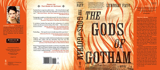
When I was first assigned this title, I was definitely intimidated. Not only am I the new designer on the block, but it's an Amy Einhorn book, and everything that Amy Einhorn touches turns to gold (like, uh, The Help, for example)! Everyone's expectations were high from the get-go, and it was made very clear that I needed to design a cover that would live up to the quality of the literature. It was what everyone described as a "big" book: a potential bestseller, and bestselling books need to look like bestsellers. So I got to it. After reading the manuscript, these were some of my earliest comps:


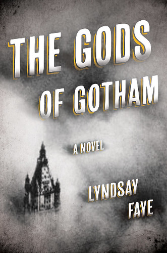
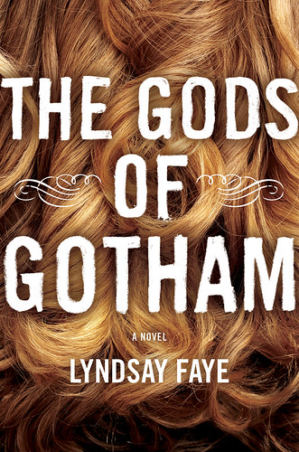
A little womp-womp, right? I got the general mood right, but not much else. There really wasn't much of the story going on here with the visuals, and besides that I needed to make it more eye-catching. I thought I'd proceed by focusing more on the girl, as she's such a pivotal figure in the story:


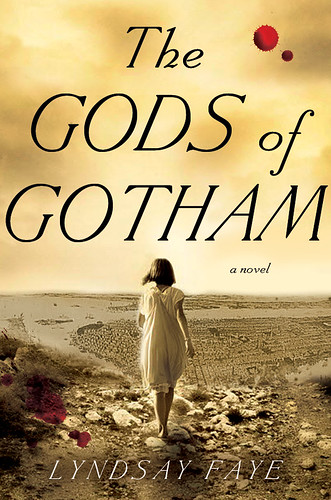
Still not quite right, unfortunately. The direction is a little too feminine for the story, and while women will be readily attracted to Gotham, I definitely knew that I needed to bump up the masculinity.


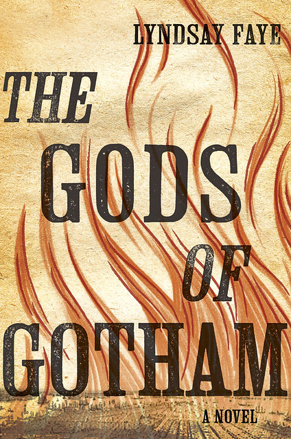
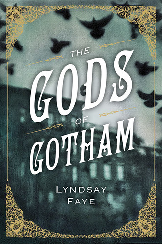
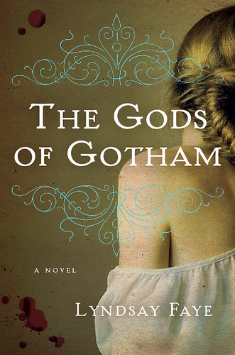
These comps started feeling as though they were getting close. I'd gone back to the text to see if I could pick up on some more useful visuals, and from that I gleaned two things: undertones of sexuality and more concretely, charcoal pencil marks. Timothy obsesses over an unrequited love interest throughout the story, and when he's alone in his room he uses charcoal on butcher paper as a way of sketching through his thoughts, trying to make more sense of them. I found a nice image of lush, sexy-looking hair, and after busting out my own charcoal pencils, superimposed the title with large, roughly drawn letterforms. Inspired by the shapes of the hair, I also sketched out some fluid fire lines with a grease pencil, so it would look both gritty and graceful. That ended up being the winning idea, and after a great deal of refinement, including the addition of woodblock type, I arrived at the final cover.
   The final effects really make this jacket sing, and they're easily my favorite part. It's printed on uncoated felt stock, so it feels nice and naturally gritty, the accented fire lines are stamped in a foil appropriately called "Fire Engine Red," and all of the type is spot-glossed, giving it a deliciously slick feel. Do me a favor and touch it if you see it at Barnes and Noble sometime soon!

Monday, October 24, 2011

Autumn Weekends

The last couple of weekends were spent with family in Pennsylvania, and I'm so glad that we were able to get a healthy taste of *genuine* autumn—something that's easy to forget about here in concrete-covered New York. The following photos were taken at Terrain @ Styer's in Glen Mills and Highland Orchards in West Chester.


Tuesday, October 11, 2011

The Great American Cookbook

Today marks the release of The Great American Cookbook by Clementine Paddleford, and it was described by its publisher, Rizzoli USA, as "The first and greatest book of regional American cuisine, now revised for today’s home cook."


Hana Anouk Nakamura from Mucca Design contacted me to do some silhouette illustrations of food, people, and animals, and I was pretty much over-the-moon about it—who doesn't love drawing food? And besides, I really could draw silhouettes all day long. Not *all* of my drawings appear to have been used in the final book, but I was very pleased to receive a beautifully printed copy the other day, and am already excited to try such old-timey, Americana recipes as "Mrs. Morton's Apple Crisp Pudding" and "Souffléd Macaroni and Cheese." Get ready, arteries.


Thanks again Hana! This was a particularly fun one.

Wednesday, October 5, 2011

Werk.

It was at about this time last year that I started an in-house freelance job at HarperCollins, working on a specific yet large-scale project that involved dozens of reprints & repackages of Agatha Christie mysteries, which were to be marketed to a younger audience. While some of the titles would be adopting cover designs from the UK, they all needed a new, more consistently branded look, to be resized to fit Harper Paperback trim sizes, and quite a few of the books needed completely new designs/illustrations. It was a really wonderful experience—the Harper art department is full of some of the industry's most talented designers, and they're straight-up great people as well. Robin Bilardello was my brilliant art director/cheerleader throughout the whole process, and that experience alone was worth its weight in gold. Robin=the best. Here are a few of my favorite repackages:


These were all done in only a couple of weeks, as the deadline was reeeeaaaaaally tight to send them off to print. I finished these covers at the end of February, and they were printed and on bookstore shelves by mid-April. That's about one nanosecond in publishing time! Typically covers are designed about one year before they're scheduled to be published.

Speaking of working ahead of time, this is a cover that I designed/illustrated for Scholastic (whose Creative Director is the absolutely wonderful Elizabeth Parisi) at about this time last year, and it's not coming out until March 2012—nearly two years later:


That's all for now; hopefully I can put together a couple of process posts soon, since I've got mountains and mountains of comps for a few of my recent Penguin titles...

Monday, October 3, 2011

WHAT UP?!

Oh my—it's been a mortifyingly long time since I've posted. Life, you know? Changes.
Here's what's changed:

I got married.
© Amy DiLorenzo
To the wonderful Jim Tierney!
© Amy DiLorenzo
© Amy DiLorenzo
© Amy DiLorenzo
© Amy DiLorenzo
...Then we went on an English honeymoon.


Two of my sisters had babies within a month of each other.


We inherited a cat named Tawny.


And then summer ended rather quietly.


Autumn is here though, bringing with it all new changes! I'm happy to report that I'm finally able to share a lot of the work that I've done in the last few months, so that'll be yet another big, honking post. Please bear with me while I play 2011 catch-up! I'm definitely ready to get back into the swing of things...

All wedding photos © Amy DiLorenzo; all other photos by me.